UCLA
Case Study
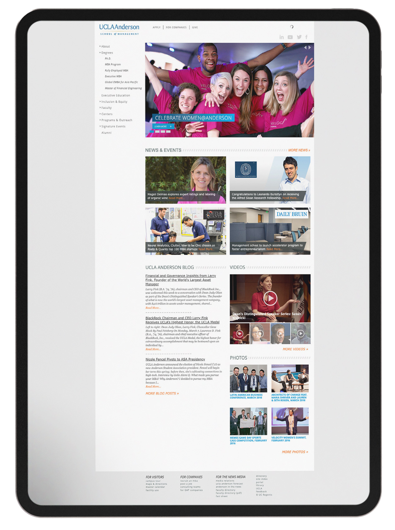
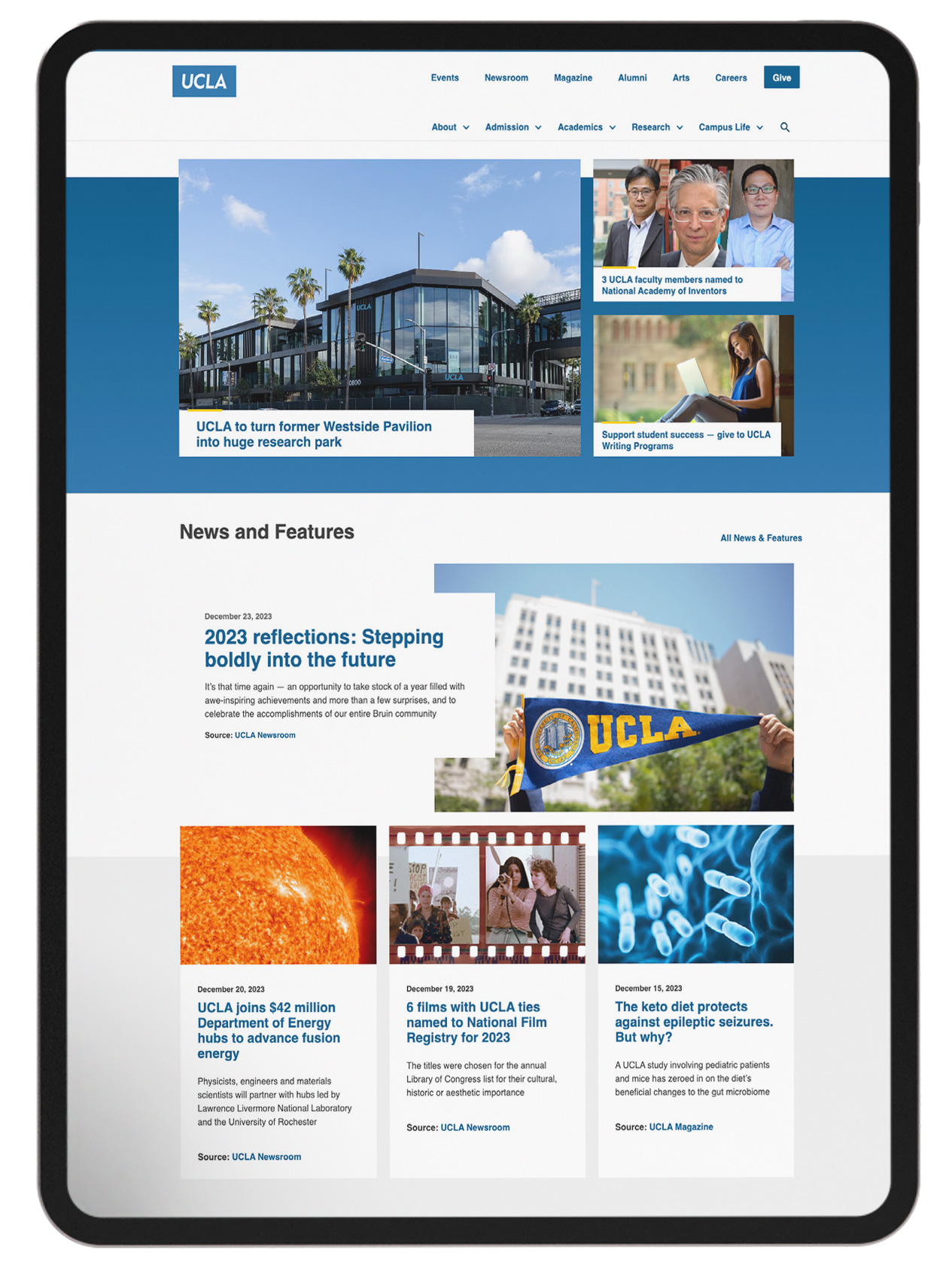
UCLA Anderson's goal was to revamp their website and bring it up to speed to be aligned with the latest web design trends. Ensuring all the information was digestable and the formating worked well across all devices were some of the top priorities when considering design elements.
Collaborating seamlessly with a proficient team of three, our initial focus zeroed in on refining the brand identity. Once the foundational elements were solidified, we transitioned smoothly into the meticulous redesign of the website, executing the entire process within a controlled staging environment on a user-friendly CMS platform.
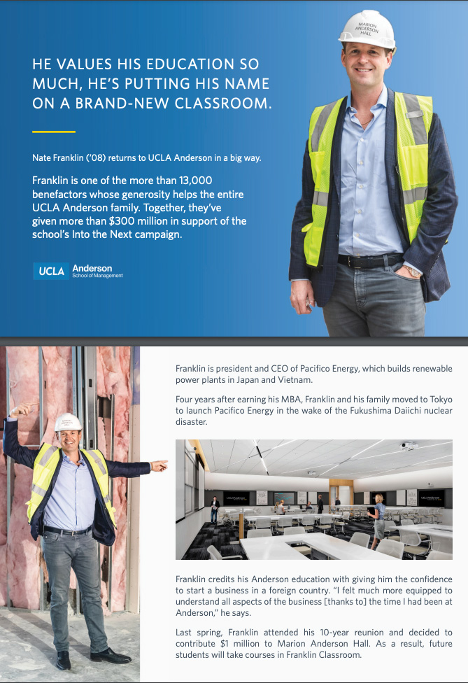
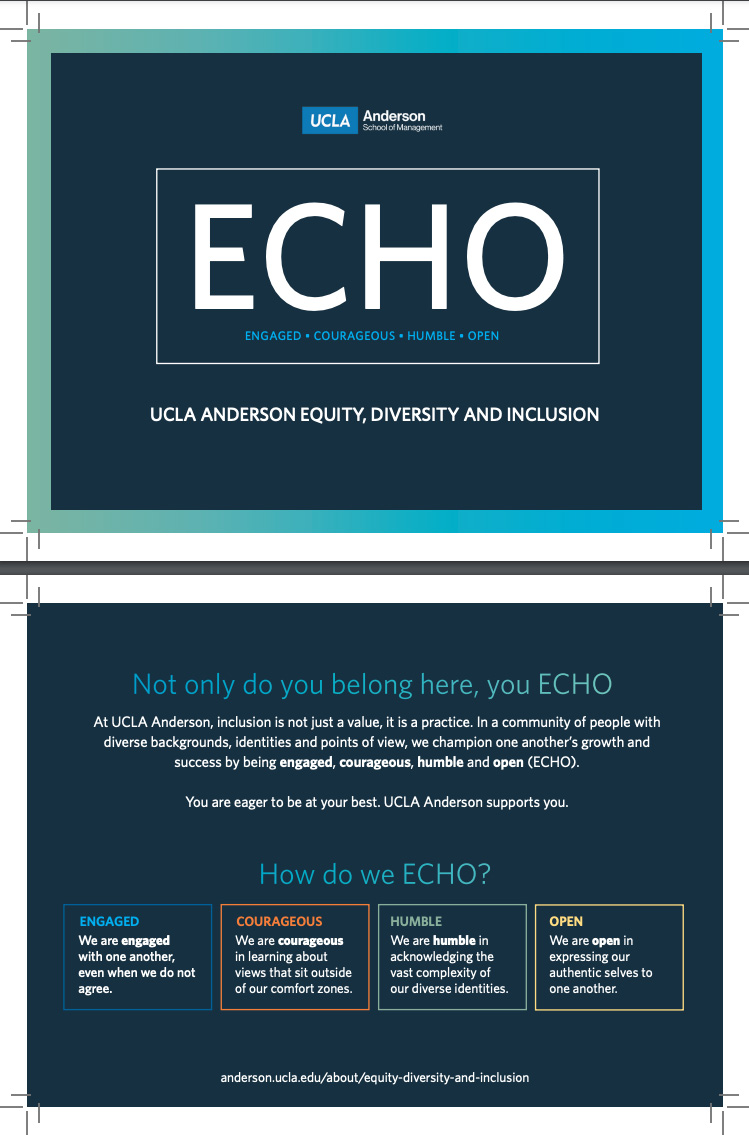
Beyond the digital landscape, the project encompassed the creation of various print assets. From meticulously crafted postcards to impactful mailers and polished brochures, every piece contributed to a cohesive and versatile brand narrative.
This multifaceted experience served as a crucible for refining my proficiency in both print and digital mediums, fostering an expansive skill set and opening doors to novel creative opportunities previously unexplored.
Previous Homepage

Redesigned Homepage

Icon Creation
Created icons that are simple but feature good contrast against the graident background. Icons were created to simplify user navigations
Print Designs

Print Designs
