Meetup Live
Case Study
Meetup Live started during the pandemic to show that even when we couldn't meet up in person, we could still connect online. Meetup usually brought people together face-to-face, but with COVID changing everything, we had to switch things up and start doing events online. To help people get the hang of it, they started a web series teaching organizers how to use tools like Zoom, Google Meet, Slack, and Discord.
People loved it! In the first 6 months, Meetup Live took off as folks saw the value in meeting online. Even after the pandemic, it kept growing. It went from teaching people how to meet online to talking about all sorts of stuff – from friendships to business, mental health, AI and so and more.
My role in the project was to create the Meetup Live logo (see above) and make art for each episode. We also started a newsletter to share episodes and bring more people into the community. Meetup Live went from zero to 200,000 members in just two years and is now a major revenue driver in the Meetup organization
Episode Thumbnails
Participates of these Meetup live events would send in their headshots and my responsibility was to create the graphics. The challenege was making them stand out. Instead of going with a uniform look I took the approach of rebranding every episode. The main reason behind this was being of the weekly newsletter feature.
Seeing attendance rates drop forced us to revamp every episode. When users receive a newsletter once a week and see a similar image they were assuming its was event. Once we change it the attendance rate sky rocketed and provided us with the conculsion of swithcing it up

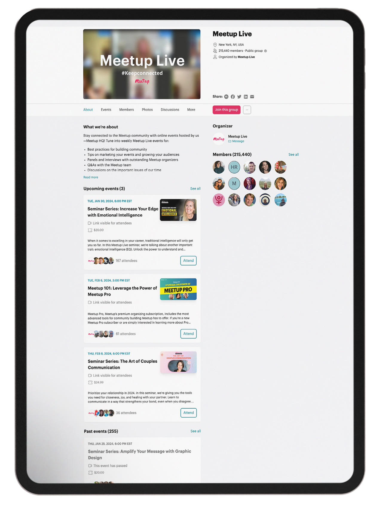
Meetup Live Group Page
The objective of the thumbnails was to be as eye-catching as possible. All the events resided on the same pages and would be shown in chronological order. The thumbnails would be adjusted to different dimensions based on their placement. All graphics were created for event pages, emails, social media, and display ads, all in an effort to give each event as much exposure as possible with the goal of increasing RSVP rates and attendance counts.

Post event
After the event aired, episodes would become accessible on the Meetup blog and YouTube channel. Once again, the thumbnails served the purpose of driving traffic and enticing users to click. Initially, we observed a gradual uptick in RSVPs, attendance, and views. However, upon altering the creative style of the thumbnails, we witnessed a notable increase of 15-20% in RSVPs, attendance, and post-event views.
