Case Study
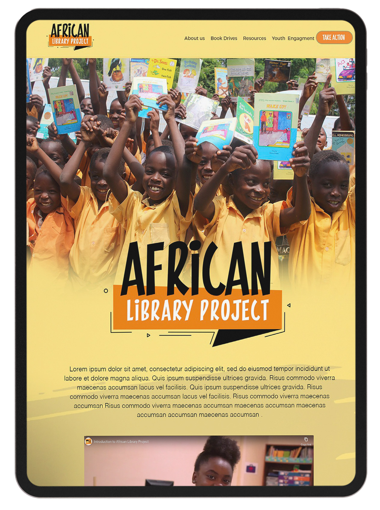
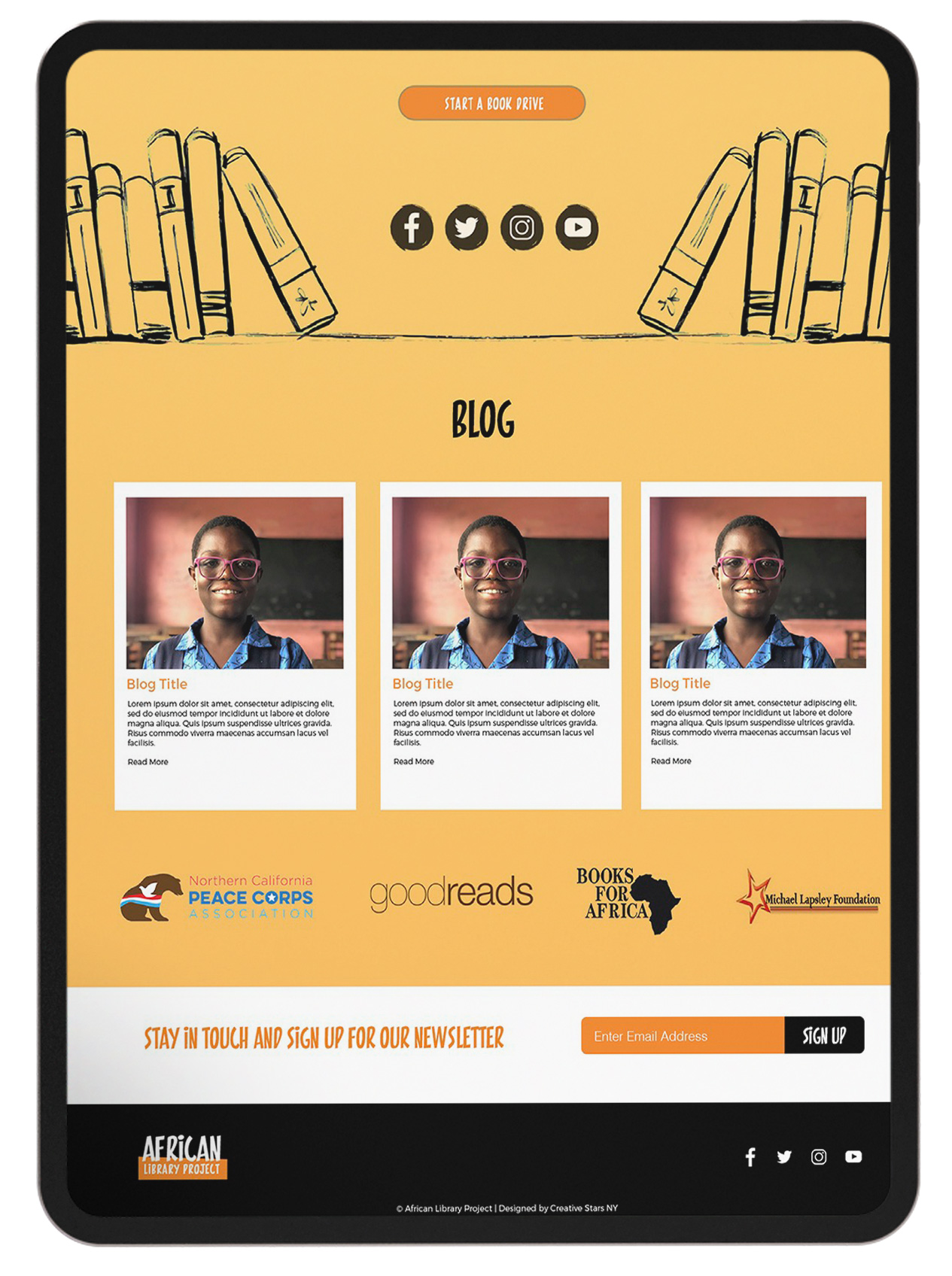
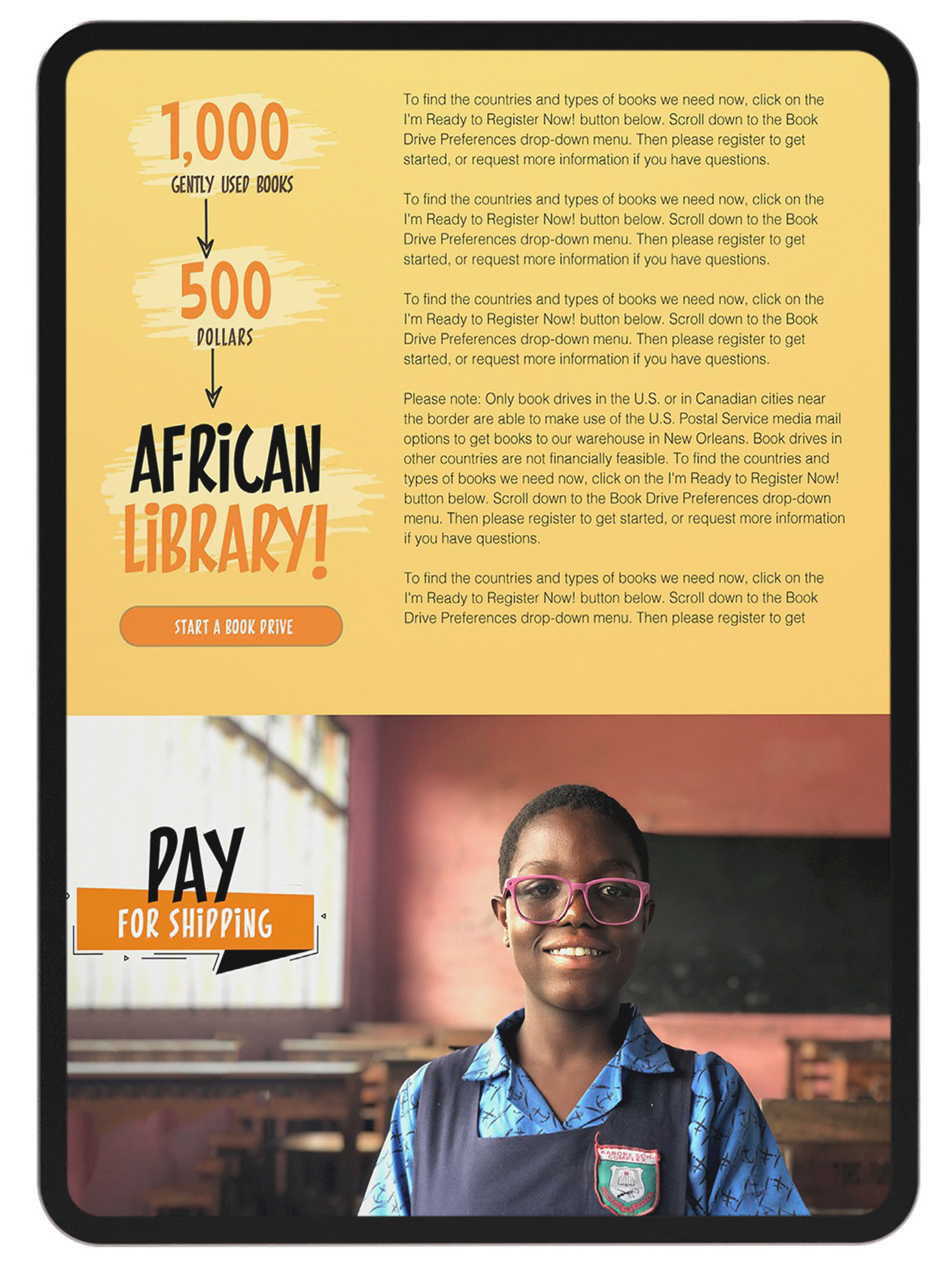
The African Library Projects brand appeared outdated, spanning from its logo to its website. The primary objective of the rebranding initiative was to craft a contemporary and up-to-date identity, encompassing both a refreshed logo and website.
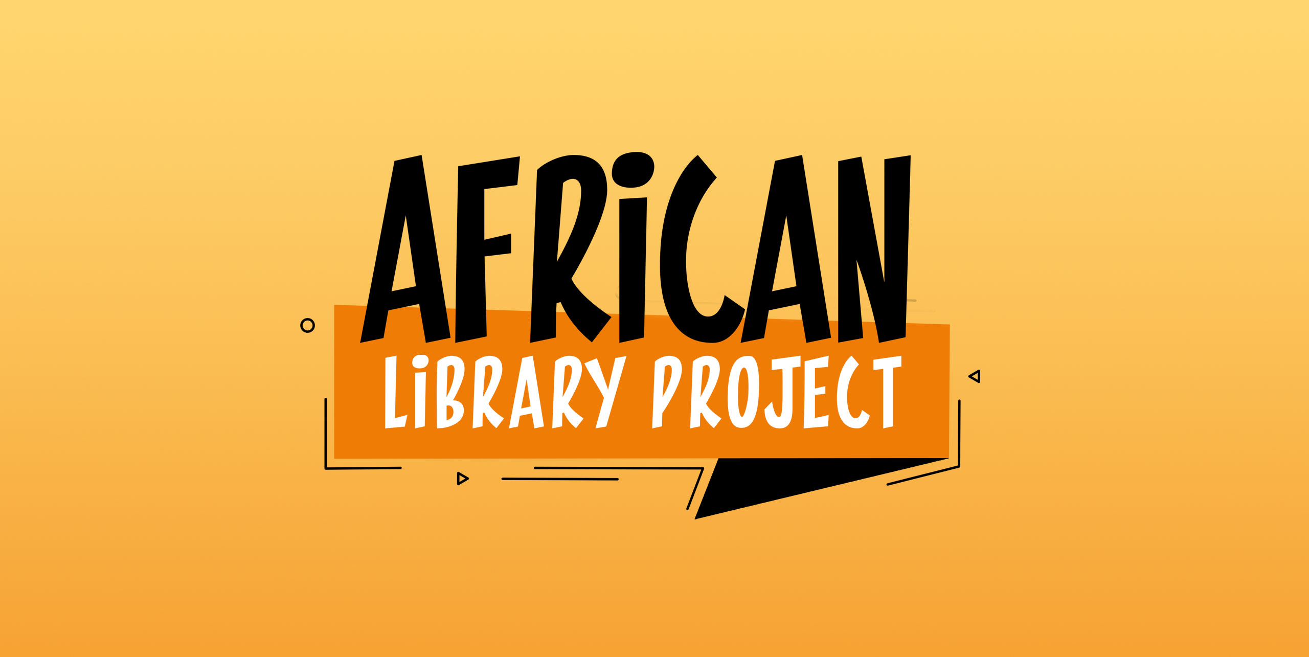
The redesigned logo incorporates a bookmark element, symbolizing readers progressing through their books. The aim was to align the initiative with the brand's initial impression.
To enhance readability and evoke a sense of impact on children's lives, the chosen font for the rebranding project was Pintanina—a playful typeface with a legible quality.
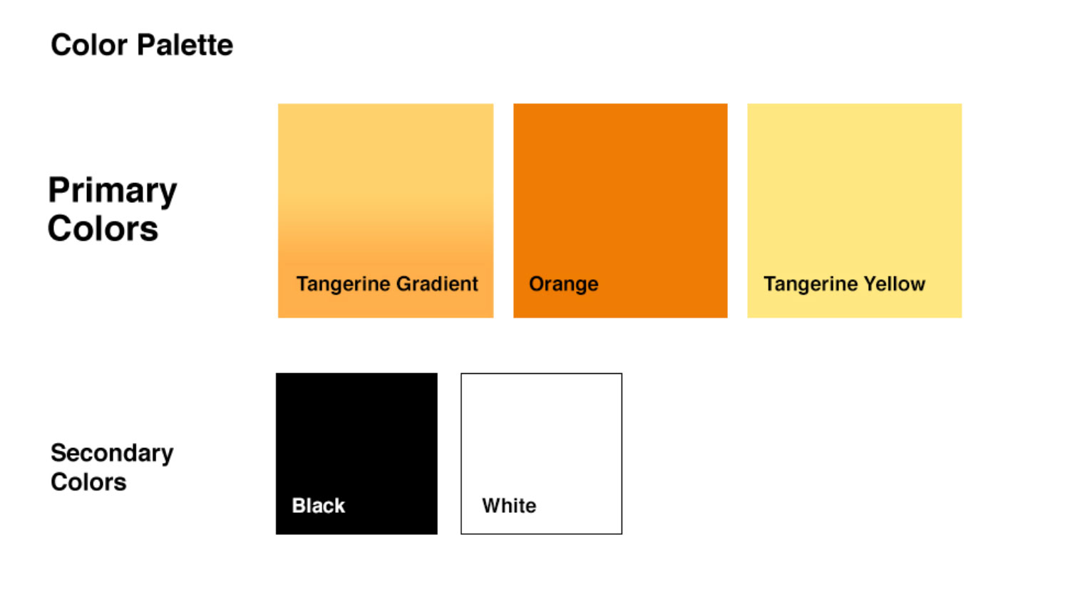
The selected colors were inspired by the predominant hues observed during my visits to schools in Africa—yellow, oranges, and blues consistently appeared in every school. After exploring various blue palettes, I opted for black as the contrasting color, with yellow and orange serving as the focal points of the brand.
In addition to the rebranding effort, a video was crafted to highlight the core mission of the organization. We traveled to the locations where ALP constructs these libraries, and areas where the book drives take place to document the profound impact the organization has. Conducting interviews with various on-site leaders, we produced a narrative-style video that effectively tells a compelling story, resonating with audiences.

Logo Usage
Whenever possible, present ALP's logo in full color and in the horizontal format. The preferred presentation of the logo should be the tangerine yellow gradient background. If space prohibits the use othe horizontal format, a vertical format may be used. Below are the 3 examples the logo may be presented, with the middle being the official branding.

